Sharecare
Summary
Sharecare is a Mental Health and Wellbeing company with a digital solution to discover, manage and improve all parts of your habits, behaviours and vitality - at a reasonable cost for US citizens. My work here was to take the existing infrastructure and modernise the user interaction, fix some glaring accessibility issues and overall bring the design back on track with the brand.
Service | UX/UI, Creative Ideation, Animation, Illustration, Iconography
The challenge for this project was taking an already ingrained UX in a user-base of millions and revitalising it without causing a major disruption that would ‘scare’ them. How do we adjust each section without fully re-building it? How do we onboard users with simplicity and clear understanding? And how do we bring life to existing tools so it actually functions as a cognitive and enjoyable experience?
Not only that, Sharecare has multiple branches of apps and programmes, so each had a distinct guidelines that needed to be adhered to, but clearly upgraded.
Out with the old
The first piece I was brought on to revamp was the onboarding flow into the application. It needed some love. It needed an friendlier experience as currently it had a lot of monotonous tapping with odd pop ups and walls of text. It needed a ‘branching’ system that by the end would push the user to best app for them. And lastly, it needed to stand out from its competitors.
I went deep into research into others in their space; Noom, Nerva, Calm – all had interesting ways of going about it, so I needed to be smart in my choices. This I looked at their strengths, but more focused on the weakness’s.
Noom was clear, but ridiculously long (164 click throughs later…). Nerva was swift, but their language was quite specific, and for this type of userbase, can be quite daunting – so a need to be cautious with wording came to mind. And lastly, Calm. Had some beautiful design in there, though with some incredibly small text in there, not WCAG approved for sure! (shots fired 🔫).
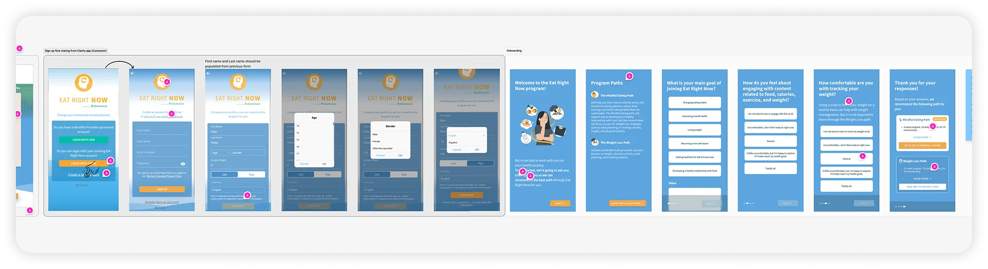
Above | The original flow, riddled with UX, brand and accessibility problems.
Below | Some stages of my rework with updates to copy size, spacing, colour correction, and pacing. For the full experience, try the prototype!

Want to play with the prototype? Click here!
Some hints for the non Figma Whizz’, press R to restart, and if you get stuck, click about the place, and then you’ll get some blue boxes that’ll show where you can interact.
With this in mind, I concentrated on engagement with key facts, illustrations and relevant graphs that focused on their specific selections. Was succinct with the steps involved as well as reassuring language that spoke to them as any expert would. And well and truly brought their branding into the premium space whilst being full accessibility approved.
This not only rocketed their sign ups by 73% within a month but it also increased their sales after the first week through the onboarding flow by 34%. Making the beginning of these new users journey feel like progress at the first step made a major difference.
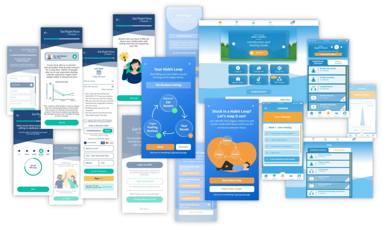
The Eat Right Now Behavioural App
With the onboarding taking on some big success, there was more to come in the realm of ‘new ideas’ that they wanted me to work on them with, but we gave some time to the now more commonly seen areas of the app. We didn’t want out new users weren’t being bamboozled by a refined onboarding to then be thrown into the depths of self-discovery with no guidance.
Again with a huge focus on accessibility standards, I updated the various sections as best as possible, without disrupting the core vision and more importantly, code. Better spaced and sized buttons. Clearer and larger font sizes, as well as hierarchy clean ups. More obvious and smart UX interactions. These slight attentions to detail really do matter in the long run, especially when there is a userbase of literal millions.
The last thing anyone wants on their journey to taking back their livelihood is a clunky and confused application.
Designing up some new
With the app in a good space, there was something brewing in the background as we cracked on with these updates. The Habit Loop.
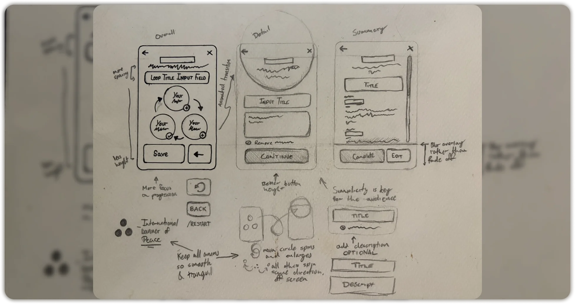
This is a tool for users identify how triggers, behaviors and results create habit loops and to see the connection between these points and better understand your own patterns. Dr. Jud Brewer had a fantastic comprehension of how people need to track these areas, but no vision on how to visualise them. The dream team forms 🤜🤛
A clear point Jud made was that each of these pieces are equal. All happen in symphony, therefore we cannot put emphasis on any of them to be the decisive factor – that also meant from a UX perspective, that they should be able to start with whichever of the 3 points they felt ready to. Another that I noted based off of his teachings, is that this should be a comforting experience that doesn’t make you feel ‘wrong’ about your habit. And lastly, I wanted to make sure this flowed nicely, guides the user – as this is a concept that feels familiar, but quite alien in practice to some when writing it down – and brings your consciousness to the ‘revelations’ of themselves.
Below | Initial sketches of my thought process, using the ‘International banner of Peace’ weaved into the structure of the UX design and animation.
The Eat Right Now Behavioural App
One of College Journeys standout features is Alice, our powerful AI ‘counsellor’ that has vast datasets of not just college statistics, but social information too, and a learning modeling technique to help families connect with the process by becoming a more personalised assistant as she learns what is best for the students and parents.
The idea was to give Alice a ‘guidance counsellor’ feel, which meant she couldn’t just be a ChatGPT response that will churn out pages and pages of overwhelming information. We had to engineer her personality to have empathy, compassion and a way to respond with the correct manor. Myself and the chief engineer for Alice researched with not just our in-house mental health experts, but utilised the understanding we collected from personally meeting various guidance counsellors from schools across the US, to get an good knowledge of tonal voice, approaches to difficult questions with those subtle ‘human’ touches, and plenty more data sources to shape Alice into the amazing guide she is today.
Devil in the details...
Taking this global signature of peace and intertwining into the design really pulled together this idea of behaviour equality to this tool to help users truly acknowledge their habits in a more cohesive light. I then provided a simple UX that allowed users to save, revisit and review their loops. Giving users these easy to use features made a big impact on how they were used to tackling these tasks, with one user mentioning:
‘I’ve never clicked with this sort of tool before like this. It always felt like something tedious, but this actually made me notice something in myself.’
I believe that one thing that really sells this type of ‘out-there’ design to academics and experts in scientific fields is by giving them a one-to-one prototyped experience for them to feel and use the tool exactly how their users will. It gives a real-time feel of the positive experiences and the frustrations in a design to figure out where we can improve.
I highly recommend having a click around in the prototype!
Want to play with the prototype? Click here!
Another little Figma Proto-Tip, there are multiple iterations in this one! Check out the left side to see the various stage updates.
Overall, this project was not only a blast, but an eye-opener for me. It was one of the first experiences of feeling I’d made a real difference in peoples lives.
A lot of the activations or launches I’ve done for awesome brands have been, well, awesome, but this was pretty special. To read reviews of people saying how much the habit mappers layout really made them connect with the programme and genuinely pushed them to really go for it was bloody heartwarming.
I’ve basically realised I will always love doing really innovative and exciting things for brands, but if I can push an ounce of care into making sure it feels good for the people that sometimes go unnoticed, I will bull-charge into it.
And for the people that get noticed a lot – the lovely, Dr. Jud Brewer – give him the respect of a more accurate illustration to his looks.